Midjourney作品拆解:七手同心抽象艺术,色彩与构图分析
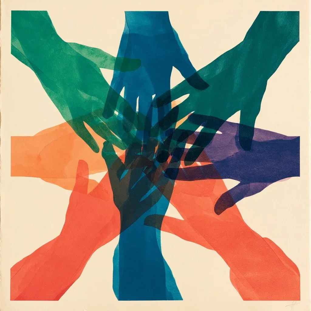
今天看到一张Midjourney社区的作品,第一眼就被它简洁又富有张力的构图吸引。这种抽象的色彩层次和透明感,复古调调很足。原提示词对主体数量和色彩的控制非常精确,值得我们仔细研究。
**提示词拆解** - 主体:七只抽象手,几何堆叠 - 色彩:七种明亮色,分层透明感 - 风格:复古纸艺,极简编辑风 - 构图:中心对称,纯净背景
**原始提示词** > Abstract contemporary artwork of exactly seven stylised human hands gathering and overlapping at the centre, viewed directly from above, reaching inward from seven directions and gently stacking like a team gesture. Each hand clearly visible in a different bold colour: emerald green, ocean blue, deep teal, warm orange, coral red, indigo, and violet. Natural proportions, five fingers per hand, clean overlapping silhouettes. Flat colour fields with subtle translucent layering and refined paper cut texture, warm ivory background, crisp edges, balanced square composition. Artistic, minimal, sophisticated editorial style. No flower petals, no realistic skin tones, no sleeves, no objects, no icons, no typography, no letters, no numbers, no labels, no logo, no extra fingers, no distorted hands, no cropped hands.
模型:MJ 8.2 比例:1:1 作品出处:Midjourney社区 @nwpaan([原帖](https://www.midjourney.com/jobs/0d2ed0f1-2a42-4016-bbf3-b0a24c790b06)),版权归原作者所有。