MJ 8.2 出的这张海景图,色彩搭配舒服,能给场景设计带来新思路
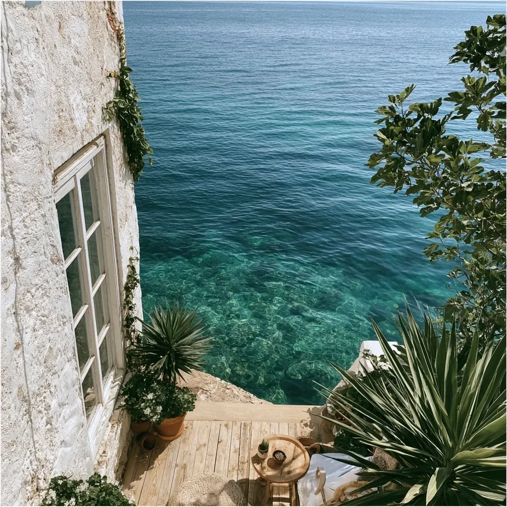
这张Midjourney 8.2的作品我一眼就被吸引了,它在色彩平衡上做得特别好,深海的宁静与老建筑的暖色调形成对比,很适合做游戏开场或者某个场景的背景图。提示词对颜色和质感的细节把控值得学习,兼顾了情绪和视觉元素。
**提示词拆解** - 场景:从窗户或阳台看平静的海水 - 色彩:深海青/海军蓝主调,暖陶土/沙色做反重力 - 风格:照片级真实感,避免绘画感,强调可见纹理 - 应用:App 首页图的风格参考
**原始提示词** > Looking to create an image for the first page of an app. Similar styling to the calm app but with a focus on looking into tranquil water. Deep ocean teal / navy as the anchor and warm terracotta / sand from a small home wiht visible grain texture as counterweight. I want the view to be based on images either from a window or balcony. The styles should represent the level of detail and coloring I'd like - so it loks like a photo and less painting
模型:MJ 8.2 比例:1024:1024 作品出处:Midjourney社区 @u3628271531([原帖](https://www.midjourney.com/jobs/14ee44df-65f1-490d-9ea7-317eda2ab73d)),版权归原作者所有。